A fresh paint palette~
Every one of us has specific color loves. Today I am wearing a green and dark grey shirt that I adore, but yesterday I couldn't think of putting it on, I wanted the light purple one. I will choose things for my home, my boys, my wardrobe that are all the same color theme -- without realizing it. I can't help it, I have very specific color addictions!
Our color loves can stay the same -- we can be drawn to the same paint chips over and over again. I see this in my life and in those close to me. Clearly, they are our heart's favorites. We love the colors we love, we instantly know what we like (and don't like!).
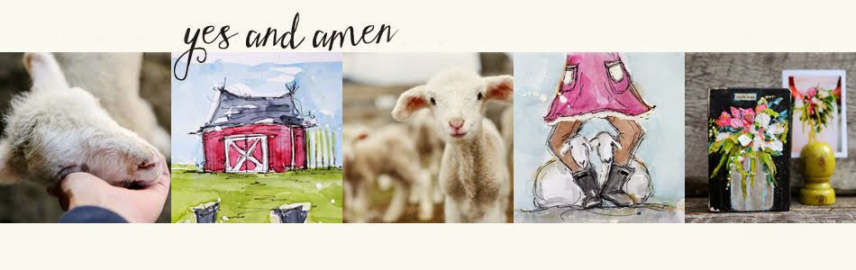
Other colors come and go as as the seasons change. Our eyes hunger for newness. Nature is our best color instructor -- waking us up with subtle hints of color in blossoms, ever-changing leaves, and little pink ears. The blues in the wood are so pretty too?
(a photo shoot this week...in delicious mustard fields. More photos here)
I am seeing my current color addictions playing out in the photos I have been taking -- nature's divine influence on my heart's palette. It is my wild-palette collection? And even though it changes seasonally I always come back to it. I simply can't help it.
It feeds my heart. Do you have colors that feed your heart, too?
I know for certain that nature influences all of my daily art. It is deeply rooted. I push myself to work outside of my favorite hues, and sometimes I am willing, but I always find myself back in my delicious-comfort-colors. Yum.
What colorful mix are you working from today? What are your go to favorites?
Do you have life-long color loves or do you roll with the latest trends?
As artists we have the freedom to choose every day (every moment!) what colors to share with the world...isn't that an exciting thought? Brand new colors everyday!
May today be filled colorful sparkle~
In His hands,
jj


Yep. I always gravitate toward peach/ melon tones to wear and love red and cobalt blue in my home. I have been longing for an earthy gray for a bedroom- how to describe it? A blue gray green? I just have to find the paint chip and it will be one step forward. So good to see you posting again. I can't wait to see/read more. Your photography is really breathtaking.
ReplyDeletelove your photo's..
ReplyDeletei'm feeling muted lately, which isn't like me, but matches my mood. funny never thought of how the two may be tied together.
ReplyDeleteI am so glad you wrote this post...I have tried and tried to like color and everything I do with color - I just don't like. I love whites, colorLESS shades, muted, white space with nothing....and blue I like least of all colors but am trying to put a tad in since "they" say everything should have a touch of blue and I think I'm the only one on earth who is allergic to it. give me creams whites very very pale pastels. Maybe now I don't have to force myself to change, it's my heart palette ;-)
ReplyDeletegorgeous photo's Junelle.
ReplyDeleteAs artists and designers I think we love colour in all it's hues and shades... I call it Colouring My World in Inspiration... yet while I love working with any colour... I always gravitate back to my absolute favourite colour combo - dusty blues/teals, creams and chocolate browns ... these colours always call me back.
take care...
hugs
Darlene
Beautiful photos, the first one is my absolute favorite. I always feel drawn to orange/red/yellow hues, definitely my color palette, but I also like light fresh green and teal.
ReplyDeleteBeautiful photos!!:O) Gee my colors seem to be bright and love Tahiti Blue and pinks and greens:O)
ReplyDeleteI loved your post Junelle!!! Your photos and words always brighten my day! I've tried to stretch my color palette and experiment with different color combos. As I look at the body of work I have done right now I can see that there are certain colors that I seem to use consistently, especially when I'm creating from my heart (or as I call it "in the zone" in a spiritual kind of way). I love blues and gravitate toward the more warm blue colors with the exception of indigo blue. I love teal, turquoise, fresh bright greens, sunny and warm yellows, burnt orange, warms reds (transparent red iron oxide= LOVE) burnt sienna, and paynes grey instead of black... or a dark blue/black or green/black. Black/black I save to sparingly use for "POP". I also prefer a warm white and I use white/white for the same kind of "POP" as I use black/black. These are the colors I gravitate to. HOWEVER, I find myself swooning over some art I see that is in complete opposite to what I use. I'm never happy trying to duplicate the tone and feeling, but I can sure appreciate it in someone else's work. I try and steer clear of dark and heavy artwork. I can appreciate the tone and feeling of despair and grief, but as someone who battles with depression I try and surround myself with light bright clear colors. LOVED this post and the opportunity to really think about the colors that make me feel in sync.
ReplyDeleteHi Junelle!! This post was so fun to read and the pictures are awesome! So happy your blogging again, makes me so happy!!
ReplyDeleteThis past year my color has gone in a wild and fun direction, now I dream in colors and wake up and have to create SOMETHING/ANYTHING with those colors. Some days I create all day long with those colors and then it passes and I move on to other colors that are calling me. Last year I discovered that white backgrounds for scrapping is what I loved but thought it to boring, NOW I LOOOOOOVE WHITE!! I've started 2 different COLOR JORNALS that are filled with what colors I'm obsessed with at the moment, I love looking back at them and being inspired again. My half bath also gets a newly colored look every few weeks as I constantly change the color theme in it.
My favorite color growing up was always blue, I could never understand how kids/adults could have more then one favorite color or change their favorites. Now finally at 42 the world is a rainbow of yummy colors for me to play with and enjoy. I still love blue but rarely use it for anything. The most soothing colors are FALL COLORS, loooove all of them and use them a lot. My all time fave color combo will be red/white/blue for the flag and living in America.
So to finally answer what my happy colors at the moment are YELLOW/GRAY/BLACK have been using them like crazy. During this year I also love the color purple which I never had before. I like to combine it with silver/gray or sometimes with yellow. Who knows what my happy colors will be in a couple weeks though.
Thanks for the post and letting us share!
HUGS!
I don't know what I love more - your photos or your art; as they both are art I love them equally. You have be blessed with a beautiful eye for art!!! Love your words, also - they are always inspiring!
ReplyDeleteI have a favorite combination that I have yet to figure it out. I love the gray-blue sky of a pending spring storm,with the bright green grass,and then the sun shining on it all! It is God's artistry that I can't match! I wish I had time to sketch and paint on a daily basis, one day!
ReplyDeleteYellow always finds its way into my pallette. I love turqouise and brown as a starting point and then I add orange or red or yellow . . .
ReplyDeleteOh Junelle, the colors in those images are exquisite - those two top images in particular... they're truly rich in essence. And the way the light pops through those pink little ears - it's genius Junelle! You teach and inspire me so much with your photography (I've even dared enter a kitty-photographic exhibition! - launching next week).
ReplyDeleteI go crazy over certain color combinations but couldn't point out a favorite... they all do things to me. I have a memory from my early teens when I suddenly discovered the beauty in the colors of rust, olive and petroleum blue... and how beautiful they looked combined. It was very different from the childhood love of vibrant clean colors - it was for sure like an adult world of colors suddenly opening up with hues and depths I've never noticed before. It brings up so many memories of moments where I saw brilliant and sparkling and unexpected color combinations - I'm right there again in the awe of it... Colors truly do magic things!
Beautiful! Purple keeps showing up in a lot of my photos lately and I think I need to paint it soon. So happy to see you posting again...was thinking about you a lot the last couple of months. Can't wait to see what new projects you have coming up this fall!
ReplyDeleteHi Junelle,
ReplyDeleteI started watching your tutorials on Christy Tomlinson's website and then finally found your blogspot today! Great stuff. You are mighty talented and I am thankful that you are willing to display it and GIVE the GLORY to God! Awesome!
I wanted to know if you sell your photo prints at all? The lamb picture in this post is ADORABLE and my mom LOVES LAMBS! I think it would make a great Christmas present for her.
Would that be possible?
Thanks and keep sharing your talents!
Ali Smith